Wednesday, May 8, 2013

Instagram Style Photo With Black Mounting Corners in Photoshop - New or Improved Skill Day 8

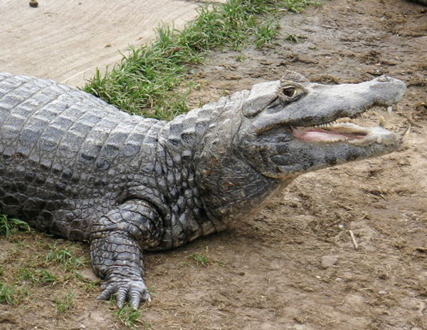
Alligator smiling


I need to get an iPhone so I no longer have to do cross processing effects in Photoshop.

The alligator not only posed, but I could swear he was smiling.

Alligator smiling after Photoshop


This is what you'll end up with, an enhanced photo with mounting corners. I have a screen shot of the layers tab further down which helps explain a lot.

photoshop tutorial screenshot


Press command j to make a duplicate of the original photo.
Click on the layer adjustment button and choose hue/saturation. Move the saturation slider until the color is dulled.

alligator


The image dulled.

photoshop tutorial screenshot


Click on the adjustment layer and choose exposure. Shift the sliders.

Click on the adjustment layer and choose gradient. Make the transparent gradient radial, 150% scale, check reverse. OK
Open blending modes and choose soft light.

photoshop tutorial screenshot


Image > adjustments > photo filter. Choose sepia and set the density for 20%.

alligator


Go to the layers tab, click on the original image at the bottom and press command j.
Apply a Gaussian blur to the new image. Filter > blur > Gaussian blur. Choose a 5 pixel radius.

photoshop tutorial screenshot


To add a white border go the original image on the bottom of the layer tab and add a new layer.
Image > canvas size. Add .5 inches. I tired 1 " and it was too large.

photoshop tutorial screenshot


The  canvas is empty and needs to be filled with a color. Go to edit > fill and choose white.

black photo mounting corner


The photo mounting corner was scanned and then cut out with the pen tool. I saved it as a png so the background could remain transparent. I uploaded it here as a png if you want to use it, it's 1" square at 300 dpi.

Place and size each corner on it's own layer. You can rotate the image by going to edit > transform . rotate. When you are happy with the position, click the check mark.

photoshop tutorial screenshot


I gave the corners a subtle drop shadow. Layer > layer style > drop shadow. The light is coming from the upper left so I didn't bother with a drop shadow for the lower right mounting corner.

photoshop tutorial screenshot

Alligator smiling after Photoshop

Tuesday, May 7, 2013

Spooky Old Folded Photo Photoshop Tutorial - New or Improved Skill Day 7

Minneapolis skyline near the stone arch bridge.


I wanted to make a ghostly, blured image so I started with this photograph of Minneapolis. It was taken early Sunday morning and was devoid of people.

Photoshopped image of the Minneapolis skyline near the stone arch bridge.


Here is the final image.

Photoshop tutorial screen shot.


  • Open the photo in Photoshop
  • Go to images > adjustments > desaturate
  • Press Command j 3 times to make 3 duplicate layers
  • Drag the original background image to the trash
  • Select the middle layer and name it soft light. Go to blending options, choose soft light.
  • Select the top layer and name it hard light. Go to blending options, choose hard light.
  • Select the bottom background layer. Go to filter > blur > motion blur. Set the angle to -90 degrees and the distance to 15 pixels.
  • Select the middle layer named soft light. Go to filter > blur > motion blur. Set the angle to -90 degrees and the distance to 80 pixels.
  • Select the top layer named hard light. Go to filter > blur > motion blur. Set the angle to -90 degrees and the distance to 200 pixels.
  • Select the bottom background layer. Go to filter > noise > add noise. Amount 25%, Gaussian, monochromatic.

Photoshop tutorial screen shot.


  • Add a new layer on top of the hard light layer. Go to filter > render > clouds. You need to have a more defined image so go to image > adjustments > levels. Move the sliders. OK. Go to blending mode and choose overlay. Change the opacity to 10%. 
  • Click on the adjustment layer icon. Choose brightness/contrast. Brightness 20, Contrast -30.
  • Click on the adjustment layer icon. Choose gradient. Style radial, angle 90, scale 150, reverse, align with layer. Change the opacity to 60%.
  • Add a new layer on top of the gradient layer. Place an image of paper, I used a ratty old book. Make the blending mode multiply. Opacity 75%.


Photoshop tutorial layers screen shot.


I find it helpful to see the layout in the layers panel.

Photoshopped image of the Minneapolis skyline near the stone arch bridge.

Monday, May 6, 2013

Forbidden Planet in Photoshop - New or Improved Skill Day 6

fantasy space scene with spaceship


Chris Spooner has a fun tutorial for making a space scene in photoshop.

It takes quite a few photos to complete the image. The Helix Nebula is from the NASA site and is royalty free.

The spaceship from Forbidden Planet was borrowed from the show.

Chris had a better image for the main planet, mine is a rock from the pond that is covered in moss. The moon is the rusty stovepipe on the wood burning stove at the cabin.

I've never played with Screen Dodge before and it gives a interesting effect. Actually, I don't use Photoshop much except for photos so it was good to attempt something artsy.

Sunday, May 5, 2013

Repeating Swatch Pattern in Illustrator - New or Improved Skill Day 5

blueprint of a vintage windmill


I wanted to make a garden themed blueprint for my garden area and found this vintage drawing at The Graphics Fairy.

Chris Spooner has a clever way to make a lined grid in Illustrator. I would have made actual lines but he made his version using the swatches panel. His way was much faster and rather magical.

line segments


I used the line segment tool to make a .25 pt line .15748 inches long. The line weight determines how thick the line grid will be.

Command c to copy.

Paste in Front, command f

Go to Object > transform  > rotate 90 degrees.

I knew I wanted the lines to be white so I changed the line color to white and dragged them together into the swatches panel.

swatches panel


You can't see the crossed lines since they are white but they are there. To use the swatch make a rectangle and fill the shape with the swatch the same way you would use color. To see the lines you need to either place a colored rectangle on top and then send it to back or place it on it's own layer.

layers panel


windmill blueprint poster


Available on Etsy.
 
black diamond swatch


I wanted to keep playing so here is a black square that I rotated 45 degrees and dragged into the swatches.

Paul Bunyon and babe the blue ox


Yes, photos work as well. I cropped and resized this photo of Paul Bunyon and Babe the blue ox in Photoshop and gave it it a small border.

swatch panel from Illustrator

Saturday, May 4, 2013

Hand Tinted Photo Effect in Photoshop - New or Improved Skill Day 4


I found another nice tutorial from Design Nocturne, he described it as an elegant sepia but it looks more like vintage hand tinting to me. I did two versions, one I added a light gradient and one followed his directions more closely. I thought it would be good to reuse the Grain Belt sign for comparison to yesterday's vintage image. I didn't photograph the steps since the original tutorial does a very nice job, the notes are a reminder in case the site disappears.


Tinted in Photoshop


Tinted in Photoshop with a gradient.


Layer 1 - Original photo
Layer 2 - Command j to duplicate the layer
Filter > Blur > Gaussian Blur. Radius 3 pixels. OK
Set the blending mode to Lighten, 80% opacity.
Layer 3 - Adjustment layer > Brightness/Contrast. Brightness 20 and Contrast 20.
Layer 4 - Adjustment Layer > Hue/Saturation. Set saturation at -70.
Layer 5 - Adjustment Layer > Solid Color. Color # 957426. Blending mode Soft Light, Opacity 20%.
Layer 6 - Adjustment Layer > Gradient. Choose Radial, 90 degree angle, scale 100%, check reverse. OK. Make the opacity around 14% for a lighter vignette.

Friday, May 3, 2013

Instagram Style Sepia Effect in Photoshop - New or Improved Skill Day 3

Grain Belt beer sign in Minneapolis Minnesota


The Grain Belt Beer bottle cap billboard is located a little off Downtown Minneapolis. I used Photoshop to give it an older, light sepia look with a slightly darkened edge.

Sepia toned Grain Belt beer sign in Minneapolis Minnesota


Link to a tutorial:

My notes. 
Layer 1. Go to Images > Adjustments > Desaturate

Layer 2. Adjustment layer button > Solid Color. Input color # ddddbf. Click OK. Change to overlay and reduce the opacity to to 50%.

Layer 3. Adjustment layer button > Solid Color. Input color # 272521. Click OK. Change blending mode to lighten

Layer 4. Edit > Fill > 50% Grey. Filter > Noise > Add noise. Amount 100%, Gaussian, check Monochromatic. OK. Change to Overlay and reduce the opacity to 15%.

Layer 5. Adjustment layer button > Gradient. Choose Radial, 90 degree angle, scale 100%, check reverse. OK. Make the opacity around 22% for a lighter vignette.
 
Sepia toned Grain Belt beer sign in Minneapolis Minnesota


This is my old method for sepia.  You desaturate the photo and play with the Hue/Saturation presets. The presets have an orange cast that I never really cared for.

Thursday, May 2, 2013

Instagram Style Cross Processing Effect in Photoshop - New or Improved Skill Day 2


Spoonbridge and Cherry in Minneapolis Sculpture Garden


I took this photo of the Spoonbridge and Cherry,  a few years ago with a very nice digital SLR camera and decided to make it look like a vintage cross processed image that you would find in Instagram.

It's ironic making photos look like vintage shots when I've spent a lot of time in Photoshop cleaning up actual old photos to get rid of the vintage appearance.

Design Nocturne has a very good tutorial on how to achieve this effect. I only wrote the directions for my own notes in case something happens to the link; I know I'd never remember all the steps.

Spoonbridge and Cherry in Minneapolis Sculpture Garden


Command j for new layer
Click on the adjustment layer from the bottom of the layers panel > gradient
Use a black transparent gradient > style radial > scale 150 > angle 90 > check reverse and align with layer
Change the blending mode to soft light > opacity 50% - this will darken the photo's edges

Add a curves adjustment layer

screen shot of photoshop curves adjustment


Add points to the curves as shown

Add a Brightness/Contrast adjustment layer . set brightness to plus 15 and contrast to minus 25 > check use legacy.

Add a solid color adjustment layer. Set color to 725c38. Set blending mode to color and the opacity to 25%.

Add another new layer.
Go to edit > fill and choose 50% grey. Mode normal and opacity 100%. OK
Filter > noise > add noise. Amount 100%. Gaussian. Monochromatic.
Filter > blur > Gaussian blur. Radius .5 pixels
Set the noise layer's blending mode to Overlay with a 15% opacity.


spoonbridge with cherry photo - text dream bidder


Dream bigger. I know I'm dreaming of a giant Cherry Pie.

 Available on Etsy

Wednesday, May 1, 2013

How To Create A New Color Palette In Illustrator From A Photo - New or Improved Skill Day 1

eagle in a nest with babies


This month will be dedicated to learning new Photoshop and Illustrator skills or improving the ones I have. The rather blurry photo is a screen shot taken this morning of a live cam of an eagle nest. Since I only care about capturing a color palette, I didn't care about image clarity and watching the baby eagles is amazing.

screen shots of how to make a color palette in illustrator


The way I used to get colors from a photo was to click on different portions of the image with the eyedropper tool. Since there is so much variety in pixels it can take awhile to get the shade you are looking for.

screen shots of how to make a color palette in illustrator


Another method is to pixelate the entire photo and choose from the visible squares.
Select the photo. You can do this by clicking on it with the black arrow, or select –> all, or using the keyboard shortcut command a.

After the photo is selected, go object–>create object mosaic. Select the number of tiles you want and click OK.

screen shots of how to make a color palette in illustrator


The photo is now a variety of colored boxes.

screen shots of how to make a color palette in illustrator


The boxes are grouped and you may want them to function independently. While the image is still selected, go to object–>ungroup.

screen shots of how to make a color palette in illustrator


One way to capture a color is to click on the eyedropper tool and click on a square you like. Go to the color slider palette and if you like the color open the drop down box (found in the upper right corner of the palette) and click create new swatch.

screen shots of how to make a color palette in illustrator


The Swatch Palette information box opens and shows the color specifications. You have the option of naming the color. Click OK

screen shots of how to make a color palette in illustrator


You could also click on a square and drag the square to the swatches panel. This method is why I had you ungroup the squares; if they were still grouped you would drag the entire image.

screen shots of how to make a color palette in illustrator


The blue square that was dragged looks different in the palette than the one I sampled with the eyedropper tool. Any swatches that you don't want can be dragged to the trash can.

screen shots of how to make a color palette in illustrator


I made some squares with the rectangle tool so I could more easily see the colors next to each other.

I made one rectangle, copied it by clicking and holding command–>c and pasting it with command–>v

screen shots of how to make a color palette in illustrator


My favorite method is to activate an empty square, and touch the eyedropper tool to the pixelated image. I like being able to see the color interaction instantly and if I don't like the shade, use the eyedropper tool somewhere else.

When you get the color you like, save it in the swatches panel.

screen shots of how to make a color palette in illustrator


To save your swatches for future use in other applications, open the drop down box in the swatch panel and select –>save swatch library as ai.

Name your swatch and click save.

screen shots of how to make a color palette in illustrator


To find your swatch again go to the swatch palette drop down menu–>open swatch library–>user defined–>and scroll for the swatch you desire.
screen shots of how to make a color palette in illustrator


When you open the saved swatch it brings it up in it's own window palette.

Color palette from the eagle nest image


You can see where the colors coordinate with the original image. The eagle's head tone that I selected is on the right. If you plan to print these colors for a project you might want to print a sample swatch since screen colors are not always the same as what you get from your printer.